Cardinal Service is an initiative to make service an essential part of the education at Stanford University. The program offers transformative service experiences that allow students to connect with the local and global community to bring about real, positive change.
The organization partnered with Stanford Web Services to facilitate a full redesign of the Cardinal Service website. We started this process by collaborating with the program team to define business objectives and site goals. We then followed this work with user research to understand the users needs and perspective when interacting with the website.
This discovery process allowed us to define a goal for the new website that will support both the organization and their users.
Increase awareness of the program by improving student engagement and user experience on the website.
Our Approach
User research through surveys, moderated interviews, and quantitate studies.
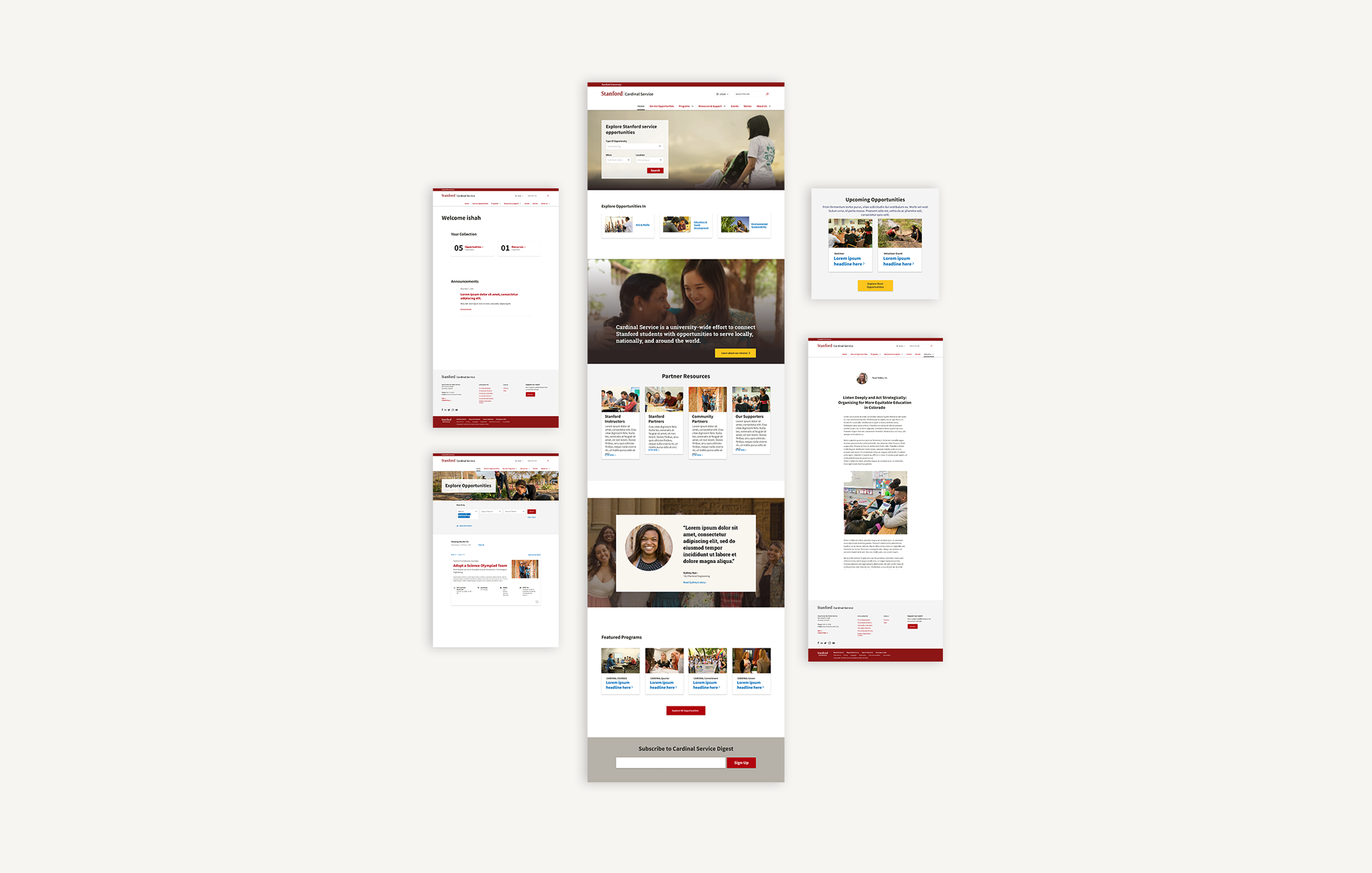
In order to understand our user needs, we interviewed students to see how they are using the existing site and learn about the type of information they would like to have access to on the Cardinal Service website. We discovered that the primary reason students used the current website is to search for service opportunities. Additional reasons they visit the website included wanting to find resources that will support their participation journey and understand if the program is a right fit. So, we set out to build a website that would make searching for service opportunities and finding resource material more straightforward.
Design Strategy
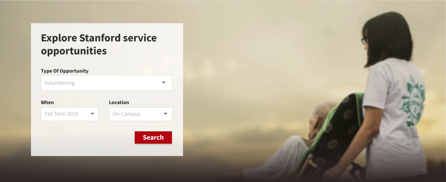
Search experience that will be meaningful to the students in their quest to find service opportunities from the diverse possibilities available through Cardinal Service.
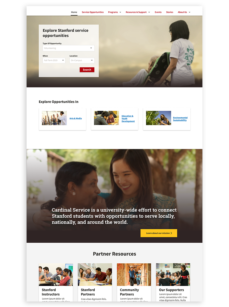
// Visit the Cardinal Service Website
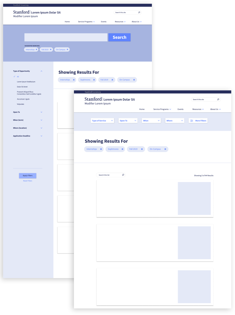
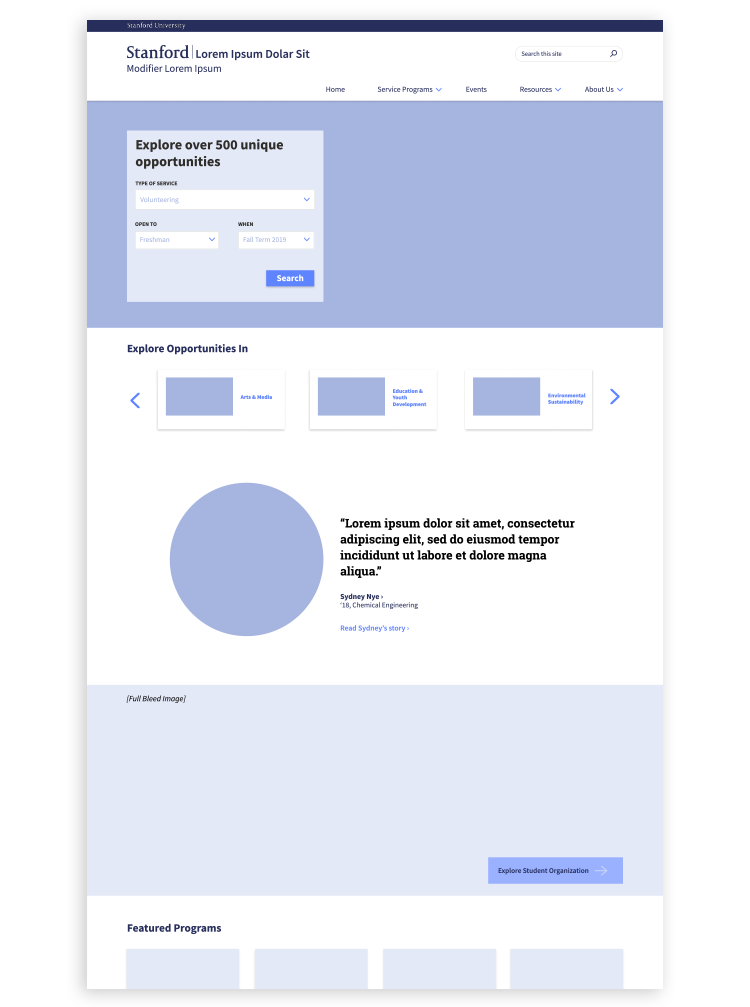
Based on the principles noted in the design strategy, we shifted our approach from creating a “search experience” to providing an “explore experience” to our students.
To articulate the difference between the two experiences, we created wireframes that show the different interaction that takes place between a “search experience” through an open search box and an “explore experience” through filters. The complete journey for this type of experience can be complex. So it was important that we lay out the full interaction and show all of the pages to help the team visualize how each piece is related to how a user would experience with the complete interaction.